The Road Less Traveled: Non-Traditional Career Paths in Education

The natural trajectory of the path to leadership in education is traditional. Most teachers trans...
#Education
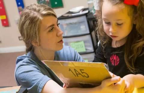
The excitement builds as students plan to go to college. All the applications are completed, deposits paid, classes selected and decorations for th...
Read Full Story
The natural trajectory of the path to leadership in education is traditional. Most teachers trans...
#Education
One of the things we are consistently thankful for is the earnest effort that UMHB students displ...
#Student Life #Spiritual Life
According to the Gregorian calendar, we are a couple of months into the new year, but from the p...
#Business
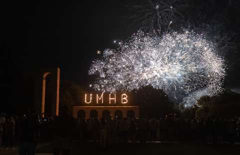
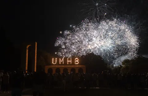
In the world of collegiate sports, March is a very exciting month due to the NCAA Division 1 bask...
#Business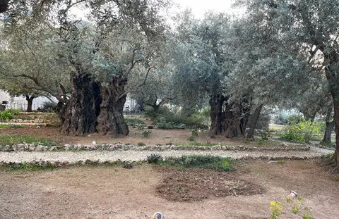
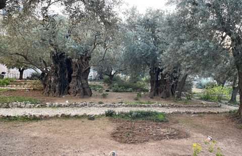
Welcome to the Garden of Gethsemane at the foot of the Mt. of Olives! Here, I traced the footstep...
#Business #Christian Business #Student Life #Spiritual Life